

Netflix’s Added Feature
Adding a feature within Netflix’s built-in design system.

Role
UX/UI Designer
UX Researcher
Practices
Visual Design, Interaction Design
Team
Solo
Timeline
November 2022
Tools
Figma, Maze, Google Forms
The Background.
Netflix is a well-established TV show and movie streaming subscription-based service based in North America. With a plethora of shows and movies to choose from, it can become overwhelming, time-consuming and frustrating for users to select a film to watch, either on their own or with others. Although there are categories and genres to pick out a show or film from, or generated recommendations to choose from with Netflix’s user algorithm, a user may still have trouble picking out all the content of interest based on how they feel at the moment.
Netflix now provides users the option to add a show or film to their My List, much like what a bookmark does, chosen to be watched later out of interest but not at the moment. This is great for keeping track of and/or collecting all the shows or films a viewer wants to watch sooner or later. However, My List does not provide any sort of filter or organization. Thus, options to choose from continues to be overwhelming for the viewer if he/she collects many shows or films on their My List. Viewers would still have to keep scrolling through all of their interested options.
How can Netflix improve the ease of user’s decision making process on a show or film selection? This would directly impact the user experience, satisfaction and in turn, customer retention.
The Problem.
With a plethora of shows and movies to choose from, it can become overwhelming, time-consuming and frustrating for users to select a film to watch, either on their own or with others. Although there are categories and genres to pick out a show or film from, or generated recommendations to choose from with Netflix’s user algorithm, a user may still have trouble picking out all the content of interest based on how they feel at the moment.
The Objective.
To add a feature to an existing product, while working within the product’s built-in design system. To improve ease of a user’s decision making process on a show or film selection, without sacrificing the existing design, organization and categorization system of the product. What would make browsing and selecting a film or show less overwhelming and time-consuming?
The Solution.
To understand user needs, motivations and a clearly defined problem users are experiencing in order to improve user satisfaction and retain subscribers. I would need to discover users’ behaviours and thought process when navigating and selecting content. I would then deliver high-fidelity mock-ups to test proposed ideas and design features.
The Process.
I put into practice Design Thinking as the primary user-centered design methodology and its five modes of thought, to gather insight, solve potential users’ problems and arrive at the overall concept for the product.
-
I do an audit of the content on existing platforms in addition to empathy research to better equip myself in understanding the users’ emotional, social and irrational drivers that affect the way the users behave; thus, allowing me to develop insights that seek to address their needs. The gaps between what users do and what they say they do are where we find design opportunities. A common mistake is using one’s own biased assumptions and creating a solution we see fit for ourselves, and not for the user or team.
-
The main goal of this phase is to make sense of the data gathered from the research and clarify the details around what will be created, why, for whom, and how. I begin to form the hypotheses and put together the structural design of content- the information architecture.
-
Here, I begin to brainstorm and conceptualize the product. Incorporating information architecture, interaction design, the usability and accessibility of it, task flows, user flows and mocking up wireframes.
-
In this phase, I create our prototypes- low-mid fidelity wireframes with interface designs and responsive visuals. The focus is on how the product will look, feel and be used. Then, I begin the evaluative process on our prototypes.
-
The last stage of the design process is to polish up the prototype using any feedback and insight given. Typically, the testing is performed by several potential customers. Once learnings are received, I summarize and implement continued iterations.
1. Content Audit
I want to research and learn what users look for on TV show and film streaming services; what makes the product simple and enjoyable for them?
Identifying current & potential pain points.
Determining features & functionalities most suitable & enjoyable for users.
Examining a user’s thought process.
Conducting primary research through surveys, competitive analysis, persona creation.
1.1 Filter Features Competitive Analysis
Distinguish similarities and differences between existing TV show and film streaming services on layout, prompts, organization, categorization, sort/filter, and bookmark features.
Searched up top and best subscription-based film/show streaming services.
Hulu and HBO Max were not available in my location, Canada, so I was unable to sign up for a free trial to analyze.
Compared a few retail websites to compare filtering and sorting options and layouts.

Competitive Analysis Findings
3/3 TV show and film streaming services organized their selection with the same or similar layout- on top or side navigation bars and throughout page as user scrolls down.
3/3 had hero image(s)/video(s) as feature shows or films for user to see.
3/3 had options to bookmark or add shows/films to their own collection to watch at a later time.
3/3 allowed users to hover on thumbnails to bookmark/add to own collection.
Netflix & Amazon Prime Video allowed users to see all genres/categories at a glance, and ability to expand each genre/category, including own bookmarked collection. Apple TV does not provide this ability.
Amazon Prime Video is the only service allowing user to sort/filter their bookmarked movies/shows, but limited filter/sort throughout the site.
Netflix is the only service allowing users to sort/filter their content except the user’s bookmarked collection.
1.2 Netflix Sort and Filter Survey
Gain insight on individuals’ wants, needs, motivations, beliefs, behaviours, shared experiences, emotions and thought processes.
Created a survey as my primary research to understand if existing Netflix users would utilize sort and filter options on their My List feature.
Shown below are the steps I took to distribute my survey.
Survey Results
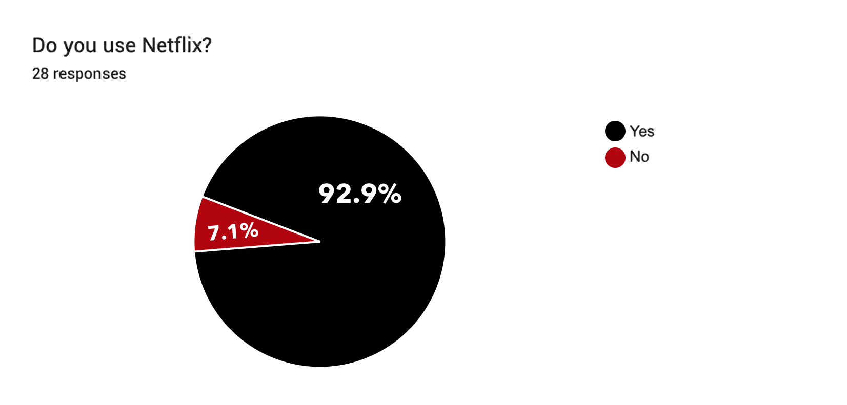
For this first question, majority of the respondents watch Netflix. As mentioned earlier, respondents who do not watch Netflix should have been guided to submit their questionnaire and not proceed with the following questions. Perhaps next time, I will manually add an additional section or write a note guiding respondents to submit their questionnaire if they do not meet all criteria for questionnaire.
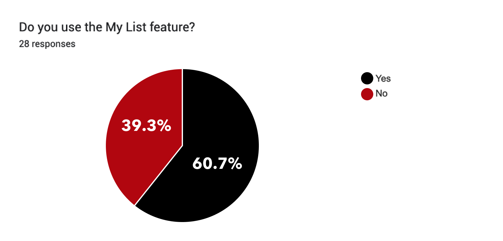
Majority of the respondents, at 60.7%, uses the My List feature on Netflix, and 39.3% of the respondents do not. I do believe the percentage of people who do not use the My List feature would be lower as this result probably included the 2 respondents who does not watch Netflix, therefore, can’t use the My List feature. The results do not accurately present the percentage of people who uses the My List feature out of everyone who watches Netflix.
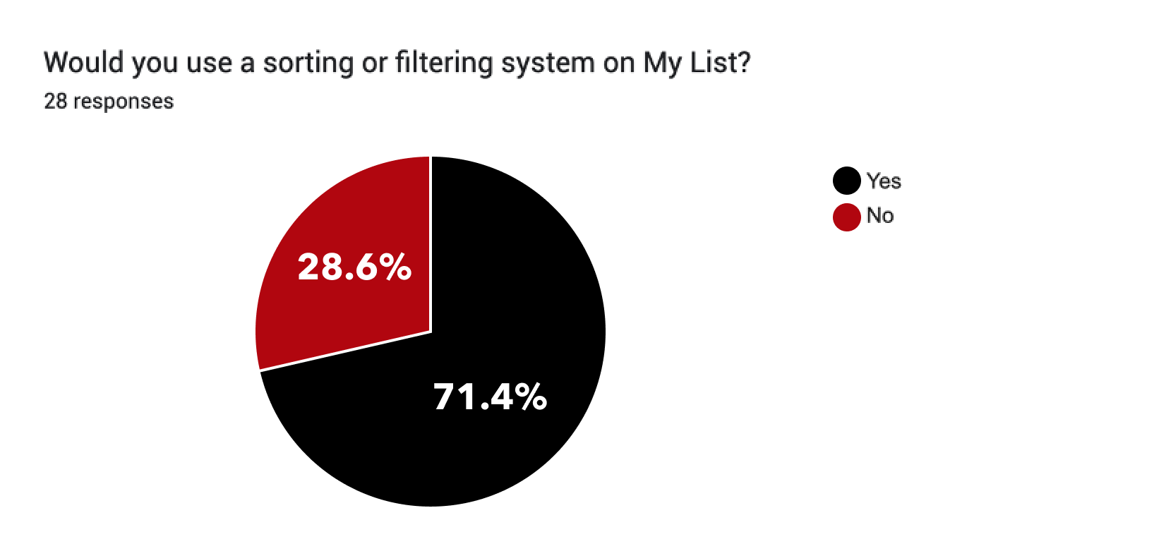
Majority of the respondents, at 71.4%, would use a sorting or filtering system on the My List feature on Netflix.
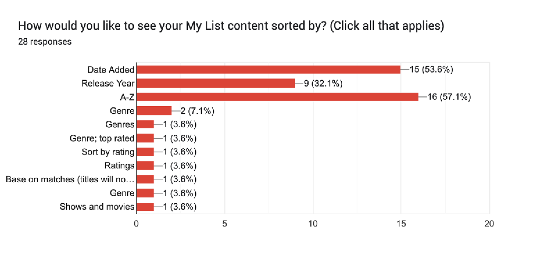
It looks like majority of the respondents would like to see the their content sorted by alphabetical order from A-Z, as well as by Date Added, followed by Release Year.
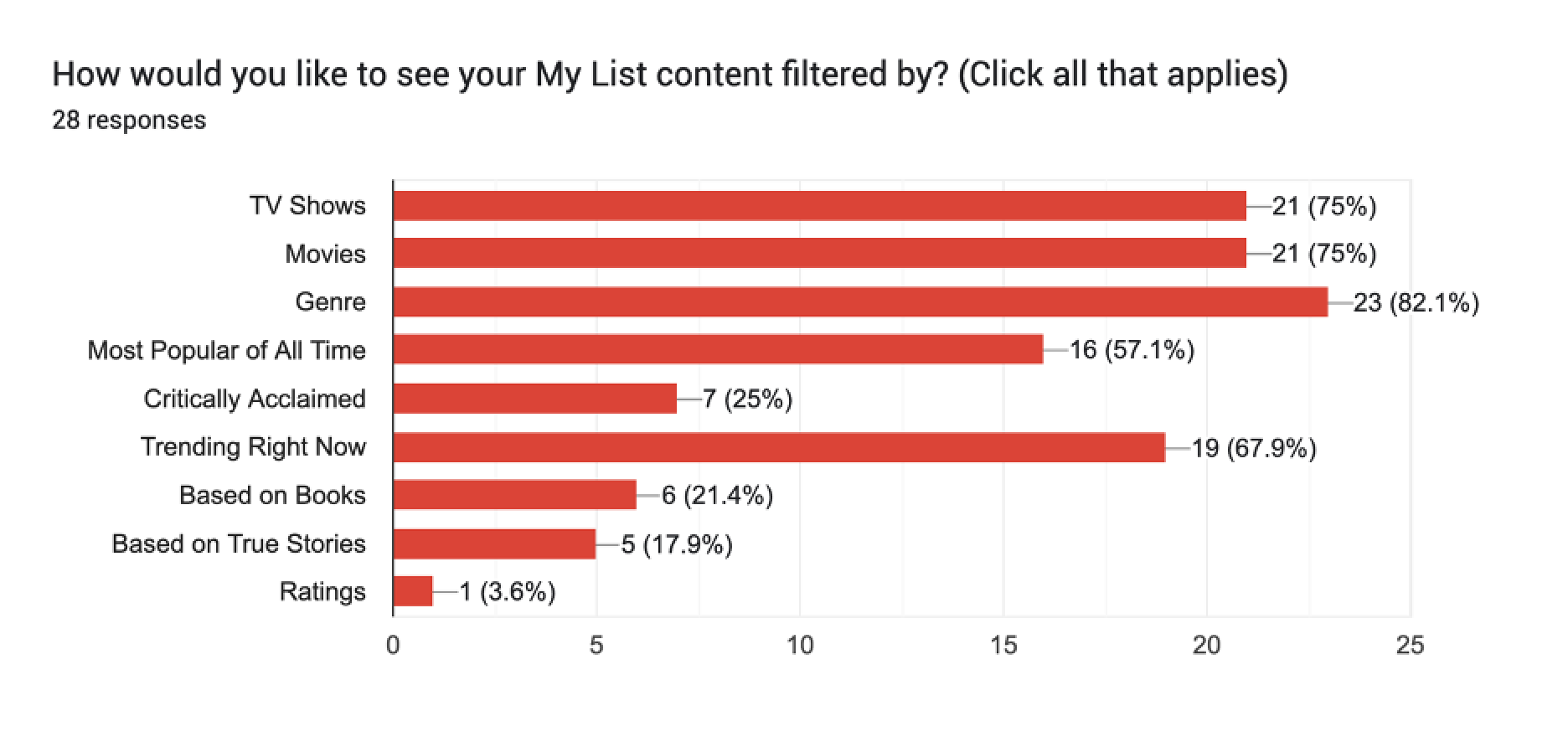
Majority of the respondents preferred to see their My List content filtered by Genre, at 82.1%, followed by TV Shows and Movies, both at 75%, followed by Trending at 67.9%, and Most Popular of All Time at 57.1%.
Overall Findings of Survey
There appears to be more than half of the population who watches Netflix uses the My List feature.
More Netflix users would actively use the My List feature if there is a sorting or filtering system in place.
The common preferences on how users would like to see content sorted on their My List are by Alphabetical Order, and/or Date Added.
The common preferences on how users would like to see content filtered on their My List are Genre, TV Shows/Movies, Trending, and Most Popular of All Time.
2. Define
How can I ensure users experience an easy, simple and seamless transition from using an already established application with a built-in design system to newly added features?
2.1 Persona Creation
Creating a persona to represent key audience based on interview findings.
Aiding design decisions & increasing empathy.
Getting a better picture of what users expect & how they interact with product.


2.2 Task Flow
A map of how users can move through the product to accomplish their goal of viewing My List.
The main flow is to visit their bookmarked show/films through My List and go through sort and filter options. To see their content organized helps the user pick out what they want to watch easier.
When the testing stage comes up, I will use this flow to measure the rate of success- ease of use and the understanding of the sort and filter options.

3. Ideate
Brainstorming and conceptualizing the site. What are the users’ goals? How will users interact with the product to solve their problem?
Incorporating research findings, info architecture and usability to define how a product will behave.
Focusing on users’ interactions and reactions with the product.
3.2 Low-Fidelity Wireframes
Visualizing where and how components and elements should be laid out.
I added my features where it would make sense for the user to find, view and use, and where it would fit within Netflix’s built-in design system.
After coming up with different options and comparing side-by-side, I opted for Option 2, below, as it balanced white space within the design system and still looked clean.

Option 1A and 1B. Put Genre under Sort list instead of Filter list as originally planned. Drop down options. 1A) User can hover over what they want to choose. 1B) User can choose one selection at a time in this option.

Option 2. User can select as many options as they want. Options are expanded horizontally by hovering, and selecting as many sub options.

Option 3. Options are more apparent with box or button-like outline.
4. Prototype
How will the features on the application look, feel and be used?
Creating interface designs and responsive visuals for the prototype.
Crafting UI Kits and style tiles.
4.1 Style Tiles / UI Kit
Following the style tile and UI elements I would need to work with within Netflix’s built-in design system.

4.2 Responsive UI Design
High-fidelity wireframes before feedback, revisions and prototyping.
Instead of having the Filter option under the Sort option, I had displayed the options side by side with adequate white space, making sure it did not look crowded.

Upon clicking My List, the Sort and Filter options are automatically visible for user to select if wanted.

When user expands the Sort and Filter options.

When user selects multiple Sort and Filter options.
5. Prototype Testing
What are the objectives, assumptions and hypotheses?
Evaluative research.
Usability testing.
Interpreting test results.
Using feedback from users, I then create the next iteration of our work and repeat the design process again.
5.1 Responsive Protoyping
Getting the task flow ready for testing.
Here is a snippet of what my flow for my prototype looks like.
The task flow is for the user to visit their My List, expand the Sort and Filter options, sort by alphabetical order, then by genre, and filter by movies.

5.2 Usability Testing
Conducted the usability test on Maze.
I had participants complete a set of tasks and answer some questions to determine the success of my prototype.
Began the test by giving my participants context:
“Netflix offers a My List feature, where you can bookmark shows and movies of your preference to watch. Currently, there is no organization or categorization in place. To make selecting a show or movie less overwhelming, more organized and optimize time efficiency, I have added a Sort and Filter option.
Sort is to arrange data in a particular order; like alphabetical order. Filter is to pick out data based on specific criteria or condition.”
Overall Findings of Usability Test
In summary, the sorting and filtering option on Netflix proves to be easy to use, and useful in organizing and saving time for users to choose their bookmarked shows or movies.
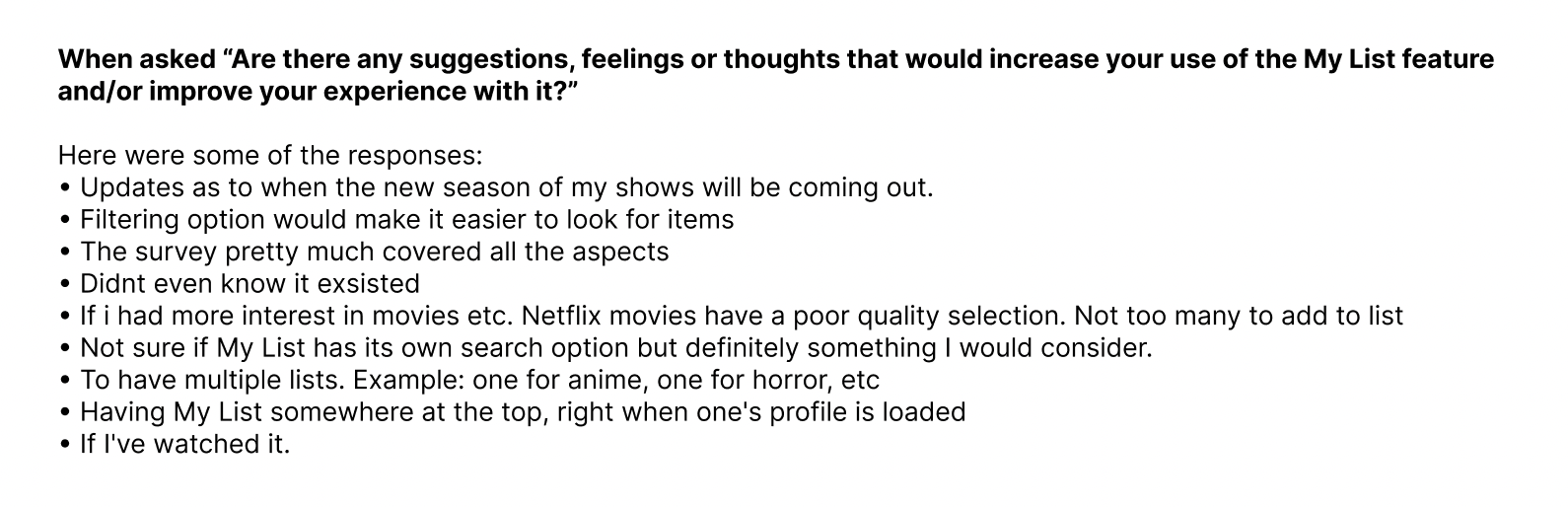
Feedback that participants shared were mostly of comments of approval in ease of use and usefulness, and the bolded comments are considerations to think about for future revisions.
Using feedback from our users, we then create the next iteration of our work and repeat the design process again.
5.3 Post Prototype Iterations & Final High-Fidelity Frames
There were many suggestions on additional sort and filter choices, such as by actor or year.
However, giving the user a list of all the possible options would make it appear overwhelming for some users and too cluttered with text.
In this case, the search icon would be best in typing in any further customizations a user wants to search for. The search icon already exists on the navigation bar so I did not add another search feature within the sort/filter options.
Minor revision included creating less clicks for user by making Sort and Filter options expanded by default, upon clicking My List.
Before revision - User to click on Sort or Filter to expand options.

Post revision - Sort and Filter options expanded by default.
Prototype:
Click below to view prototype.
Conclusion
What I learned:
I learned to work within an established app’s brand and built-in design system. For some, this would be considered as very strict constraints but for the features I worked on, I believe the Netflix’s design system provided great structure and starting points in knowing what, where and how the users would proceed with sorting and filtering options.
Hovering to expand or select options would only work on desktop but not mobile/tablet/TV.
What I would do differently:
I would want to learn more about Netflix users’ experiences on features they enjoy, feedback on what they would like improved or enhanced, and what features they would like to see that do not currently exist within the application yet. The My List feature may not be a feature commonly used by some users but hearing about other common pain points and goals of users may help in furthering improvements in other areas of the application.
The next steps:
Conduct another round of usability testing.
Explore a sort/filter feature for TV use.